Skip to content

PDFs and Vector

PDFs and Vector

If you have ever lost vector art, listen up. If you loose your native files (Illustrator, InDesign, Quark) and only have a .pdf of the work, you can put that .pdf back into Illustrator and anything that was vector in it's native form will go back to such. If the type was still in tact and not converted to paths, it will require some clean up, but all vector objects will be perfect (or as they were in the final file to the printer - some illustrator treatments require flattening or rasterizing, which you would need the editable version of these graphics to go back to). As so many printers are now requiring single-page .pdfs for output, these are invariably saved as final files to the printer. Printers may have them on file and you may still have these files on your local drive should your server crash. I have seen this happen. Massive amounts of data lost. Tears. Heartache. Despair. If you have those .pdfs, you will at least get back your precious vector art. :)

Read More

Vector Graphics and Your Logo

Vector Graphics and your Logo

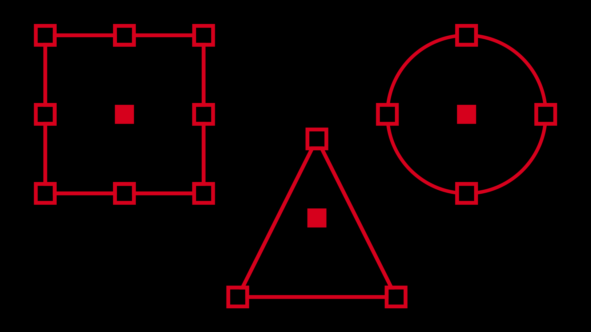
One of my FAVORITE topics. :) Vector graphics are created with math as opposed to pixels like a bitmapped image. Pixels are heavy. Vector is very light. AND it's infinitely resizable. Your graphics will always be crisp at any size. With that said, your logo should always be created in a vector-based program (Illustrator, Freehand, Korel) - NOT Photoshop. When a logo is created in Photoshop, designers can forget that this brand will need to cross over other mediums in addition to the lo-res webpage they're creating it on. If they are mindful to use the vector shapes within Photoshop, that will help. But then you get into filters and such. There are things you can do in Photoshop that can't be done in Illustrator (yet). When a logo is created with these types of filters and treatments, the logo has trouble going to a larger size and has to be re-done to accomodate. In addition to this issue, you run into a busy logo. Simple graphics and easily read type are crucial. Consumers must have the same positive experience each time they come in contact with your logo, they must also have the same image of the logo reinforced…

Read More

Pantone Colors and Your Brand

Pantone Colors and your Brand

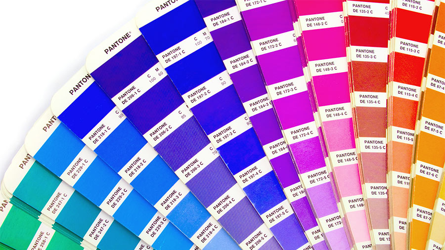
Have you ever had a logo created and then tried to have it printed, only to find out that it looks like crap? Well, dry those eyes. There is help. :) Any time you have a logo created, it should be created in vector-based format (we'll get into vector-based objects and their value tomorrow... stay tuned). The relevance here, when dealing with color is... Creating your logo in vector will allow it to go from print to web flawlessly. Photoshop doesn't maintain true Pantone values and can skew your color slightly. Even being just a few numbers off can create a bad color situation. Pantone colors are a set of colors that can go from spot (RGB) to 4C process (CMYK) without as much variation between the conversion from RGB to CMYK than if you just went into your color pallette and started mixing colors willy nilly. When you break down a color to 4C process, you loose saturation. You only have 4 colors that need to make up thousands or millions of colors, so there will be variation in your color when the conversion takes place. Pantone colors reduce the amount of variation. They have swatch books that you…

Read More
Back To Top