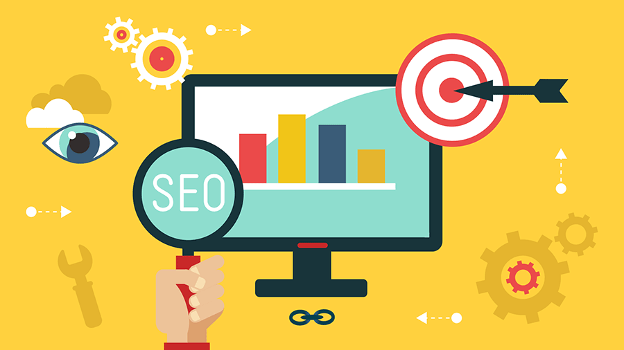
Skip to content

The Total WordPress Theme by WPExplorer

Total Wordress Theme screen shot of demo

Today I want to talk about the Total Wordpress theme by WPExplorer. We'll look at the theme features and talk with AJ Clarke, the developer of Total. I have been using Total since 2014. Before I found the theme, I was using a different Wordpress theme for every site. Wordpress themes tend to have limited customization abilities. If you use the same theme for all of your sites they end up looking the same, even with custom CSS. This means learning a new theme every time you build a site. This also means finding glitches in the code, things don't work right, etc. I have used a ton of themes since I started using Wordpress over 10 years ago; Avada and many more. Every time I'm left feeling like "I wish it did this." I don't have that problem anymore with Total. It just DOES. It could be the poster child for Nike. Total is completely customizable. You really can create an unlimited amount of designs. It's truly insane. The day I installed this theme and saw what it could really do, I nearly cried. Yeah, I know… You're thinking "Get a life, nerd." and I DID - After I…

Read More

WordPress: A Wolf in Sheep’s Clothing?

Wordpress: A Wolf in Sheeps Clothing

Everyone wants to use Wordpress. Wordpress! Wordpress! Yay! Yay! Yay! It's free, it's easy, it's... sometimes very problematic. I'll be the first to admit I love Wordpress. I love the shit out of it. But there are times when it isn't appropriate to use. Wordpress wasn't meant to perform all of the robust features and functions we try to glean from it. It is but a humble blog that was SO awesome that folks saw potential there. That potential is valid as long as you don't try to get too crazy with it. As a general rule of thumb Wordpress works great if you are simply displaying content (text, images, videos), or selling product or services via PayPal. Heck, I'll even go so far as to say Woo Commerce might serve you well if you really want to put a retail module in place on your site. But that's it - That's as far as you should go with Wordpress. When you make Wordpress do things it wasn't meant to do, it creates huge problems later. Problems you can't always see in the beginning. Plugins tend to be the culprit in many cases. If you're having trouble, look to thy…

Read More

Naming%20Conventions

Naming Conventions

Yeah. Spaces happen. Then you get that ugly "%20". Naming conventions for your files are very important. It is best to employ a simple, systematic naming convention for all your daily files. Whether you're keeping track of content, site slices, whatever... There are a few rules of thumb that can avoid issues later on. 1. Spaces. Just forget the spacebar exists on your computer. If you must have space, use an underscore "_". This will avoid issues such as uploading files to a server or directory paths to images on a website. Also avoid non-standard characters like: ' & ; When a space occurs, you get the "%20" and the path can't be followed, leaving you with broken links or bad FTP uploads that disappear. 2. File names and their length. I have seen some image files on websites that have over 100 characters in the file names. WTF!? Seriously folks... Try to keep the file names as short and to-the-point as possible. When slicing up a site, I execute a very page-specific naming convention that potentially allows all the images to reside in the root images directory if they had to. Every sliced file name becomes a mini-directory about…

Read More

Resolution for Print and Web

Resolution for Print and Web

You can't use your low resolution logo from the web to have printing done. Forget about it. Only Chuck Norris can do this successfully. You need to have the right resolution for print and web for best results. Bitmapped images are made up of pixels, the smallest unit a computer can display data. When digitizing an image, you will need to select the desired amount of pixels per inch (PPI) or dots per inch (DPI), depending on what you want to do with the image. Incidentally, PPI (web) and DPI (print) are interchangeable terms, meaning essentially the same thing. Web = 72 DPI Print = 300 DPI* *You can go down to 250 DPI in some cases until the naked eye will see degradation in the image. Large format printing is usually done between 100-150 DPI (posters, banners, tradeshow booths, billboards). Most large format printing is not meant for someone to be standing up close to it. Up close, the images will not look as sharp and you will see the dot from the print. But from a distance, the image will look fine. This is where vector art can come in real handy. Vector can go large format and…

Read More

Quick Keys

Quick Keys

Take a look at your drop down menus at the top of your desktop. Click on one and notice the characters to the right of the options. Those are your quick keys. By typing that configuration, you will get the same action to the left. When you are rockin' out in Photoshop, there isn't time to keep going up to the edit menu, selecting copy, then going to where it will be pasted, going back up to the edit menu, selecting paste. F that. Select your text or object, hit Command+C, or for Mac users, hit Apple+C. Select area to be pasted, hit Command+V, or for Mac users, hit Apple+V. Voila. Done. Try them out and see how much quicker you can work. Most quick keys are the same from software to software, but can differ.

Read More

.JPG or .GIF

JPG or GIF

Image compression is a huge deal for websites. Tours on paysites can be very graphics-heavy. There are ways you can save your slices to crunch them way down in file size and preserve the integrity of the image. You should save an image as a .jpg if it has a photo in it or a complex background. Basically, anything that isn't a solid color should get saved as a .jpg. If you are using Photoshop's Save for web, select 2-UP so you can see the original on the left and the one you're editing on the right. Make sure the right image is selected and choose .jpg from the drop down menu on the right. I usually set my compression to 65. If your page isn't graphics-heavy, you can go higher. Some images will show degradation at 65, so you may want to bump it up a little. If your image is solid color, like my logo for instance, save it as a .gif. Solid color has no gradients or halftones, hence less colors. Think of it as a cartoon or coloring book. You have lines and shapes filled with solid color. Go back to Save for web and get…

Read More
Back To Top