
We cannot put enough stress on the importance of proper branding. Branding isn’t just a logo. It’s your business’ whole persona – The voice that comes through in the body copy, what causes the business supports, the chosen colors that represent the business and how those colors are used, and many more things… It’s exactly the same way you are perceived as a human being. What traits do people know you for, personally? Do you have a great sense of humor? Are you super organized? Your business will come to be known for the things it does and conveys.
Consistency. That is the mantra for branding. Once your logo is established, a set of rules should be created showcasing approved versions of the logo, along with chosen Pantone colors, fonts, and any other specs that must be upheld to maintain brand integrity, like a mission statement.
We are inundated with advertising in this modern age. The average consumer needs to see a logo seven times before they remember it as a brand. Any time your logo is released into the public space that deviates from the original approved versions, you create brand confusion. The consumer must then see this new version seven times for it to become known to them. If you then revert back to the original, or a third variation, the consumer must start over again and remember this version. When you keep changing your logo, it’s equivalent to introducing yourself with a different name every time you meet someone. No one will ever know who you are.
Another facet to consider is the cleanliness of the logo. I believe in getting to the point. A busy logo isn’t always a good thing. You want to convey an instant message with your mark. We don’t want to make the consumer search for it, because they won’t. They’ll move on.
Discipline is the key to maintaining a stable brand. By following these foundational branding principals, you will create a stable environment for your customers that consists of trust, loyalty, and retention.
May your brand be clever and your Pantone colors be pure!
Additional Services

Marketing

Graphic Design

Programming

SEO

Public Relations
Branding Articles
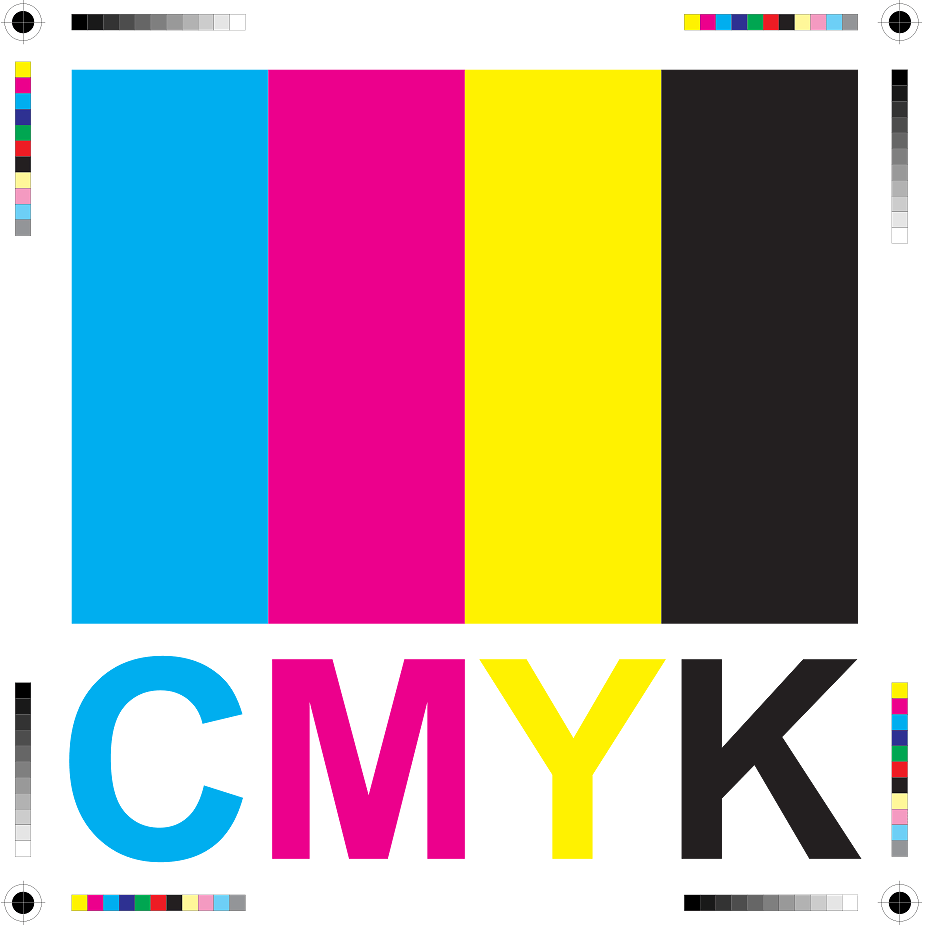
Color Correction
There are many factors that go into getting the best color out of your brand. After a while, the colors you use become the brand as well. Let's look at Pepsi or Home Depot. Those brands are recognized by the colors - because they are consistent. Color also has psychological effects. Most casinos and restaurants are red or have lots of red accents (red makes you want things). Purple is a sign of sensuality, bisexuality, spirituality, creativity, wealth, royalty... All colors have some affect on us. Now, the first thing to tackle is the calibration of your monitor and making sure your Photoshop color settings are set to match. Adobe recommends using Adobe 1998. Your monitor should have some basic color calibration settings that can be adjusted. If you're on a Mac, (aside from being lucky) you can go into your system preferences and do a custom calibration if the Adobe 1998 isn't doin' it for ya. The closer you can get your monitor to "reality", the less work you will have to do. The second thing you have to do is learn to go by the numbers. If you are preparing an image that will be printed, you must…
Vector Graphics and your Logo
One of my FAVORITE topics. :) Vector graphics are created with math as opposed to pixels like a bitmapped image. Pixels are heavy. Vector is very light. AND it's infinitely resizable. Your graphics will always be crisp at any size. With that said, your logo should always be created in a vector-based program (Illustrator, Freehand, Korel) - NOT Photoshop. When a logo is created in Photoshop, designers can forget that this brand will need to cross over other mediums in addition to the lo-res webpage they're creating it on. If they are mindful to use the vector shapes within Photoshop, that will help. But then you get into filters and such. There are things you can do in Photoshop that can't be done in Illustrator (yet). When a logo is created with these types of filters and treatments, the logo has trouble going to a larger size and has to be re-done to accomodate. In addition to this issue, you run into a busy logo. Simple graphics and easily read type are crucial. Consumers must have the same positive experience each time they come in contact with your logo, they must also have the same image of the logo reinforced…
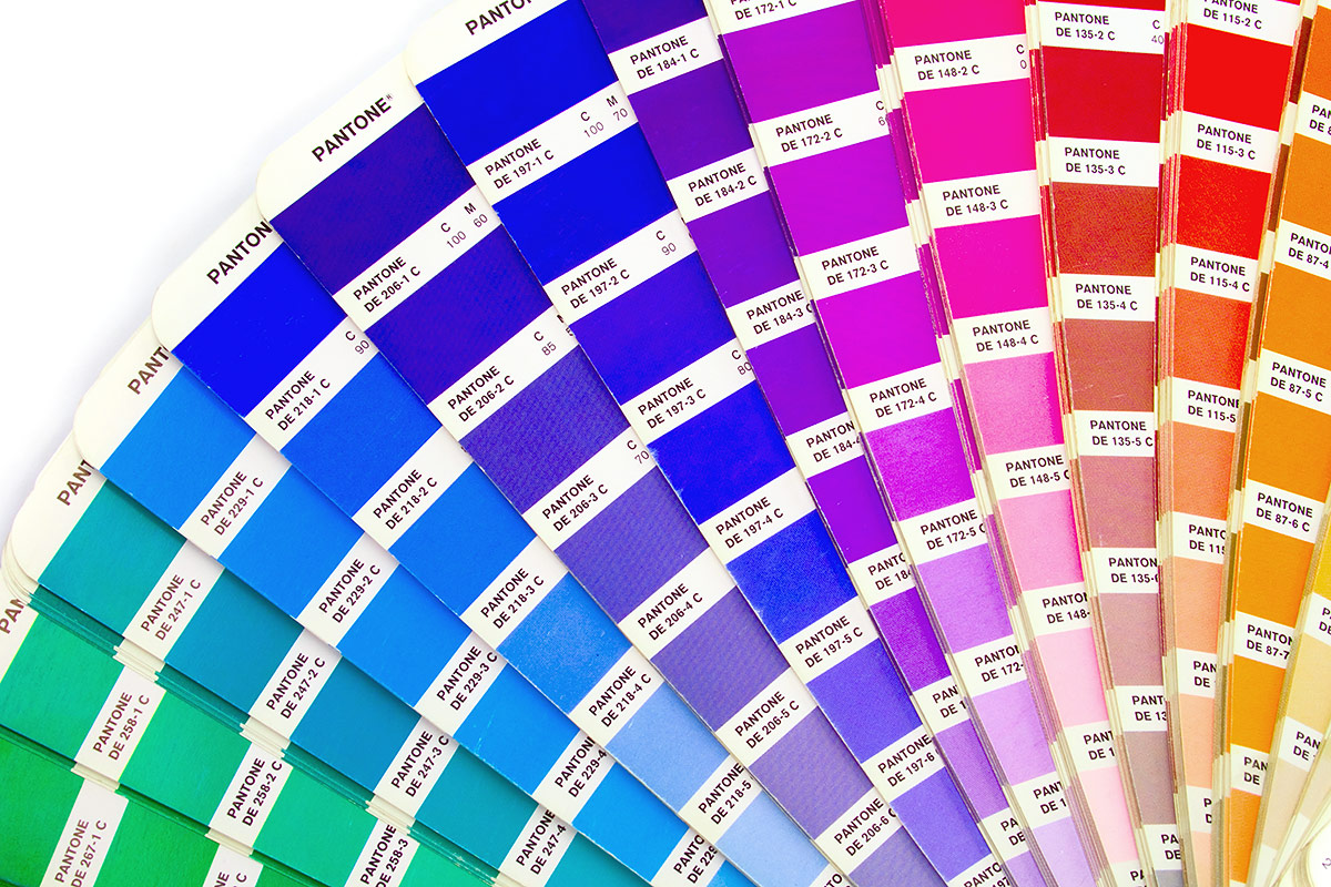
Pantone Colors and your Brand
Have you ever had a logo created and then tried to have it printed, only to find out that it looks like crap? Well, dry those eyes. There is help. :) Any time you have a logo created, it should be created in vector-based format (we'll get into vector-based objects and their value tomorrow... stay tuned). The relevance here, when dealing with color is... Creating your logo in vector will allow it to go from print to web flawlessly. Photoshop doesn't maintain true Pantone values and can skew your color slightly. Even being just a few numbers off can create a bad color situation. Pantone colors are a set of colors that can go from spot (RGB) to 4C process (CMYK) without as much variation between the conversion from RGB to CMYK than if you just went into your color pallette and started mixing colors willy nilly. When you break down a color to 4C process, you loose saturation. You only have 4 colors that need to make up thousands or millions of colors, so there will be variation in your color when the conversion takes place. Pantone colors reduce the amount of variation. They have swatch books that you…