PNGs are eating our storage and slowing down our websites, but nobody seems to notice.
As a web developer and graphic artist who also handles pre-press for print, I look at thousands of image files a week. I keep seeing the same problem: PNG files being used in places they have no business being.
PNGs have quietly taken over. They’re the default export in half the software we use, so people grab them without thinking twice. The problem is, nobody realizes just how massive these files are compared to a properly saved JPG. That bloat doesn’t just sit there quietly, either. It’s eating up space on your phone, your computer, your paid cloud storage, all of it. Disk space costs money. Storing PNGs when they could be a fraction of the size is just throwing that money away.
And it gets worse once these oversized files hit the web. I regularly see hi-res PNGs sitting on live websites at like 20-25 megabytes. For one image. Hello, slow page load times. Frustrated visitors are bouncing before your site even finishes rendering. Google notices, too and it will ding your rankings for it.
So let’s fix this. Here’s how PNG is actually supposed to be used, why it gets misused so often, and what you should be reaching for instead.
What a PNG is actually good for.
PNG stands for Portable Network Graphics and it was built to do two things really well: hold flat, solid color with crisp edges and support transparency.
That makes it the right call for:
- Logos: especially ones with hard edges, flat color, or type
- Icons: same deal, clean shapes and solid fills
- Any image that needs a transparent background: think a logo floating on a colored section of a website, with no white box around it
PNG is a lossless format. It doesn’t throw away image data to compress the file the way a JPG does. That’s fantastic for preserving sharp lines and flat color. It’s also exactly why PNG is a terrible choice for photos. More on that in a second.
What a PNG is not good for and why it keeps getting used anyway.
Photos. Anything with gradients, halftones, or a ton of color variation and soft blending needs to be a JPG, not a PNG.
Here’s the technical reason: A JPG uses lossy compression, which is designed specifically to handle the kind of gradual color shifts you get in a photograph. It throws away the color data your eye won’t miss and keeps the file small. PNG’s lossless compression, on the other hand, has to preserve every single pixel exactly as it is. Feed it a photo full of subtle gradients and it can’t compress much at all. The file balloons.
I think the reason PNG has taken over is simple: it’s often the default export setting in design software and it always looks good. There’s no visible compression artifacting to make someone go “hm, that doesn’t look right, let me fix the format.” It just quietly produces a giant file that looks fine and nobody questions it until the site is crawling.
A quick real-world sizing example.
Say you’ve got a photo of a product shot, roughly 1500 x 1500 pixels. Saved properly as a JPG at a reasonable quality setting, you’re probably looking at somewhere in the 150-400KB range. Save that same photo as a PNG and don’t be surprised to see it land at 3-8MB or more. Same image, wildly different weight, and the PNG doesn’t even look any better. It just looks heavier to your server.
Multiply that across a site with 30, 50, 100 images and now you understand why some websites take five seconds to load a page that should take one.
The web workflow I use.
Here’s how I sort it out, slice by slice:
Is it a photo, or does it have gradients, halftones, or a complex background? Save it as a JPG. I usually start compression around 55 in Photoshop’s Save for Web and adjust up or down depending on how much it degrades the image. Some images fall apart at 55, so you may need to bump it up.
Is it flat, solid color with no transparency needed? Save it as a GIF, not a PNG. A logo or icon made of flat shapes and type doesn’t need PNG’s overhead. GIF handles solid color beautifully and keeps the file tiny. Reduce your color count to make it as small as possible without degrading the image and you’re done.
Does it need a transparent background? Now, and only now, you reach for PNG. This is the one job GIF can’t really do well (GIF transparency is all-or-nothing per pixel, no soft edges) and JPG can’t do at all.
If you do need that transparent PNG, don’t just export it at whatever massive dimension your design file happens to be. Size it down to the actual pixel dimensions you need on the web. A logo that displays at 300px wide on your site does not need to be a 3000px wide file. That’s just wasted weight sitting on your server for no reason.
PNG and print: just don’t.
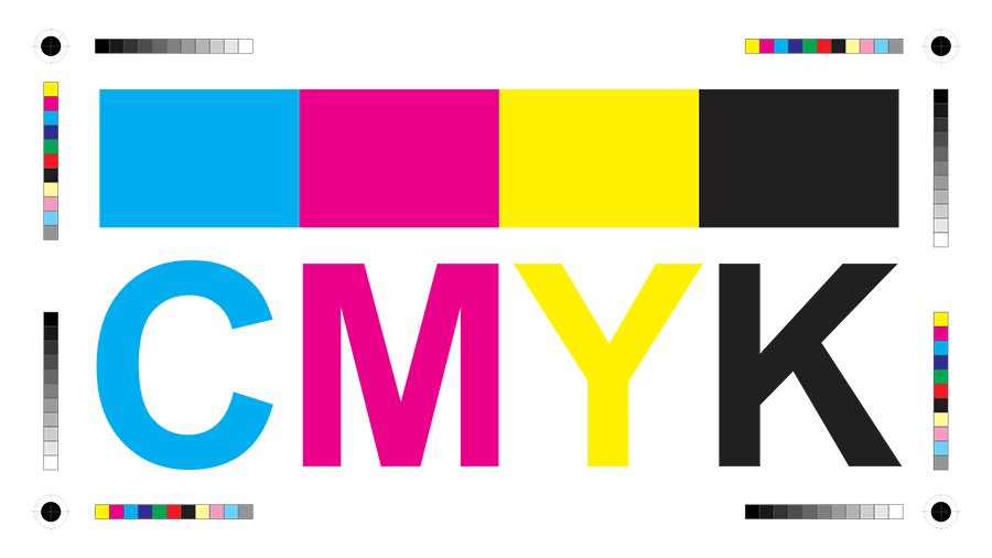
I see PNG files linked into print layouts constantly and it needs to stop. PNG is an RGB, web-only format. It cannot hold CMYK color data, which is what your printer needs to actually reproduce your colors correctly. Try to force it and you’ll get color shifts, muddy output, or an outright rejected file from your printer.
For print, you want TIF or EPS files as your linked images. Both formats support CMYK properly and hold up at the resolution a printed piece actually needs, generally 300 dpi at final size, not the 72 dpi a PNG pulled from a website is going to give you.
And while I’m already on my print soapbox: please stop laying out print pieces in Illustrator when you’ve got linked raster images. If your entire layout is 100% vector, Illustrator is fine. But the second you’re placing linked assets, you need InDesign. It’s built for page layout, linked images, and print production. Use the right software for the job. And Canva? Canva can suck it. Back to PNGs…
I don’t hate PNG. I hate seeing it misused.
None of this is a knock on PNG as a format. I use it constantly. Being able to export a small, crisp logo or icon with a clean transparent background is genuinely one of the best tools we have as designers and developers. That’s exactly what PNG was built for and it’s great at it.
What gets me is watching it get used as a catch-all default when it’s the wrong tool for the job, because there are real consequences. A print job that gets kicked back or prints wrong because someone linked a PNG instead of a TIF. A website that’s hemorrhaging visitors because it’s loading 25MB of images that should’ve been a fraction of that size. These aren’t hypothetical problems. I run into both of them regularly.
Quick reference: which format do you actually need?
- Photo, gradient, or complex background, for web → JPG
- Flat color logo or icon, no transparency needed, for web → GIF
- Flat color logo or icon, transparency needed, for web → PNG (sized to actual display dimensions)
- Any image going into a print layout → TIF or EPS in CMYK
Get the format right and you’ll save disk space, speed up your site, and keep your print jobs out of the reject pile. That’s a win across the board.