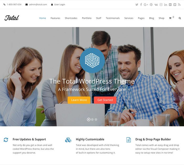
Today I want to talk about the Total Wordpress theme by WPExplorer. We'll look at…
Have you ever had a logo created and then tried to have it printed, only to find out that it looks like crap? Well, dry those eyes. There is help. :)
Any time you have a logo created, it should be created in vector-based format (we’ll get into vector-based objects and their value tomorrow… stay tuned). The relevance here, when dealing with color is… Creating your logo in vector will allow it to go from print to web flawlessly. Photoshop doesn’t maintain true Pantone values and can skew your color slightly. Even being just a few numbers off can create a bad color situation.
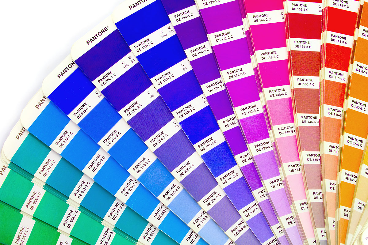
Pantone colors are a set of colors that can go from spot (RGB) to 4C process (CMYK) without as much variation between the conversion from RGB to CMYK than if you just went into your color pallette and started mixing colors willy nilly. When you break down a color to 4C process, you loose saturation. You only have 4 colors that need to make up thousands or millions of colors, so there will be variation in your color when the conversion takes place. Pantone colors reduce the amount of variation.
They have swatch books that you can flip through to pick your colors and see how they will look once they are converted to CMYK. You can pick your brand colors with knowledge before the logo is created and be able to sleep at night. :)
Related Posts