Today I want to talk about the Total Wordpress theme by WPExplorer. We'll look at…
5/1/2014 Update: As Murphy’s Law would have it, Facebook changed their layouts again yesterday. I have updated the template and you can download it here: 5/1/2014 Facebook Template
I will continue to update the templates as Facebook and other social media outlets update their layouts. Just check this post when you see things have changed on your profile pages. Please note the new template above is not reflected in the examples below. I’m too angry at Facebook to update everything.
I want to share some info on social media templates, or skins, as they’re sometimes called. I have worked up a series of examples and templates for you to use from a site I manage called Baubles-n-Bling. Download the layered PSD templates if you want to follow along!
It all starts with the main site. We recently migrated it over to Shopify. When we post the new sale on the homepage, we want to spin this look out across all social media outlets. This is the sale hero that appears on the site:

When designing the main site graphic, keep in mind that you will have to dismantle it to fit the look into social media templates. Don’t design yourself into a corner. Be flexible and use elements that can move about without causing disruption to the theme.
I created these templates by taking screen shots of the desktop and mobile views of Facebook and Twitter. I put them into a layered Photoshop file and voila! A template is born. Below are screen shots of the Facebook and Twitter templates and their corresponding layer palettes. The Facebook template is based off the new page layout. Not everyone has been migrated over yet. You can click any image to enlarge.
Facebook Desktop View Template

Facebook Mobile View Template

Facebook Template Layers

The Facebook template has 2 sections: One for the desktop view and one for the mobile view. I set up the layers in sets so you can easily toggle between the desktop and mobile views.
Before you start designing, copy and paste the actual white text that appears over your Facebook page cover photo into the template. I have included these editable text areas for you to paste the text into. Every page has a different amount of overlaying characters, so by inserting the actual text that lays over the graphic, you will see how much space you really have left on the right. For Baubles-n-Bling, I copied and pasted their info into the template:
BaublesNBling.com
Vintage Store – Home Decor
It is important to design your graphic so the most important info isn’t getting covered in either view. I start designing with both views turned on. Then I toggle and make adjustments. Just remember that the desktop view gives a bit more space, so you can use the section to the left, but it will get covered on the mobile version. This is why I have the “15% off” burst on there twice. I know the larger one on the left will get covered on mobile, so I inserted the smaller one in the lower right corner. I was careful to center up the larger one on the left so the mobile version will just look like I placed a decorative burst behind the profile pic, which is what is over this area on mobile.
The top and bottom will also get shaved off a little on mobile, so don’t put important info close to the top and bottom edges of the graphic.
The mobile view also moves that white overlaying text up into the middle. This creates a crappy situation. You should not insert other text in this area because it will get covered up. I remedy this by keeping clean, solid shapes or patterns in this section (hence the white bar across the middle of the graphic). The mobile view adds a gray transparent gradient that allows the white overlaying text to be clearly visible, but everything under it kinda falls away.
The desktop view requires a different treatment. Because it doesn’t add the gray transparent gradient under the profile pic and white overlaying text, you have to manually darken your background so the white text will show up. If you look at the desktop and iPad views of the Facebook graphic below, you’ll notice the lower left area under the white text is a little darker green than the rest of the graphic. I had to cheat the color by creating a gradient that allows the white text to be seen. That way I get my cake and eat it, too. I kept my nice pastel green but the white text is still readable.
Facebook Desktop View

Facebook iPad View

Facebook Mobile View

Next we move onto Twitter pages. I’ll start out by saying I know they’re in the process of migrating over to the new look. However, there are still lots of folks on the old layout and this info may still be useful, if only for a short time. I considered doing a template for the new layout, but it’s so clean and simple no template is needed. The cover photo is only covered by the profile pic in the lower left corner on the desktop view, so you have freedom to place stuff wherever you like. Just remember the mobile version will still look the same as my mobile example below – it centers the info over the middle of the cover photo. You should keep text out of this area.
Again, copy and paste the actual white text that appears over your Twitter page cover photo into the template. I took a cue from Facebook and added my own gray transparent gradient under the white text. This is an optional layer that you may not need if your background is already dark enough to show the white overlaying text. Just turn off that layer in the template.
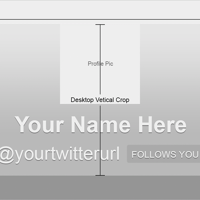
Twitter Desktop View Template

Twitter Template Layers

The Twitter background image is a little easier to manipulate. It doesn’t change much across different devices (they don’t crop it). The profile pic tends to range in size, but that’s about it. You just have to be sure to keep important text toward the top left and right. The profile pic will sit higher on some views due to the increase in it’s size (see Twitter iPad and mobile views below and compare to the desktop view).
Twitter Desktop View

Twitter iPad View

Twitter Mobile View

When saving your files for web, don’t put any jpg compression on them. Facebook and Twitter will do this automatically – especially Facebook. They crush the shit out of images. It makes them look really bad. If you notice your cover photos are looking very pixelated and over compressed, go back and re-export the files with no compression. Out of Photoshop go to File > Save for Web > Compression 100. Also be sure to turn off the template layers before you export.
Now upload your photos and test them out on all your devices. Make tweaks if needed, but be sure to delete previous versions so you don’t have duplicates hanging out on your profiles.
You can view the live graphic while it’s still up, and social media pages at:
http://baublesnbling.com/
http://www.facebook.com/baublesnbling
http://twitter.com/baublesnbling
Related Posts