Get the most out of your print layout.
During the printing of your piece the paper can shift and your art will land in a slightly different place in relation to where it will be trimmed. To avoid this from being noticed on the final piece always be sure to leave room for this shifting in your layout.
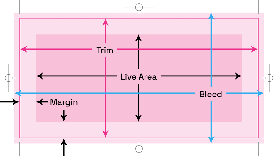
Trim: The size that your work will be cut to.
Margin: The area around the outer edge of the piece to allow for printer shifting.
Live area: The area in the center, minus the margins where important info should remain, not going into the margin.
Bleed: The amount of artwork that needs to “bleed” off the edge, over the trim to account for printer shifting. Usually .125″ – .375″, depending on pub.
When you have specs for any print piece, you should always have the above 3 sets of measurements, 4 if you have a bleed. MANY pubs do not supply live area. I usually have to call them and ask what they want it at. Sometimes they don’t care, sometimes they don’t know what I’m talking about. When in doubt, I like to give it a nice 3/8″ (.375″) to 1/2″ (.5″) margin on a print ad that is around 8.5″ x 11″. If it is for an oversized pub I’ll go up to 1/2″ (.5″) to 3/4″ (.75″).
A good printer can get up to 1/16 of an inch from the trim for things like business cards, maximizing your live area. For magazines, there must be a much wider margin — .25″ – .75″ from the trim — depending on the publication. Some publications will have different margins for the top and bottom (.75″) and left and right (.5″).
So, here is the formula: If you have an ad for a pub that is 8.5″ x 11″ at the trim and their margin is .375″, all four sides with a .125″ bleed, your live area goes down to 7.75″ x 10.25″.
In this live area is where you want to keep all of your text and important elements. The background (or anything that isn’t important and can be cut off) can extend out to the trim, into the bleed if your ad has one.
Leaving a decent sized margin has other benefits. It will keep your text from falling into the gutter. That is the center where the pub is bound together. If possible, try to guarantee left or right placement in the pub. That will allow you to know which side is going into the gutter.
This is especially important when you are doing a spread and your text jumps the gutter. Make sure you leave the margin space. It will look odd when you print it out, but if you put them together and pinch them in the middle to simulate binding, you will see the text come together.
If you do have a bleed on your print piece, make sure to account for it when designing.