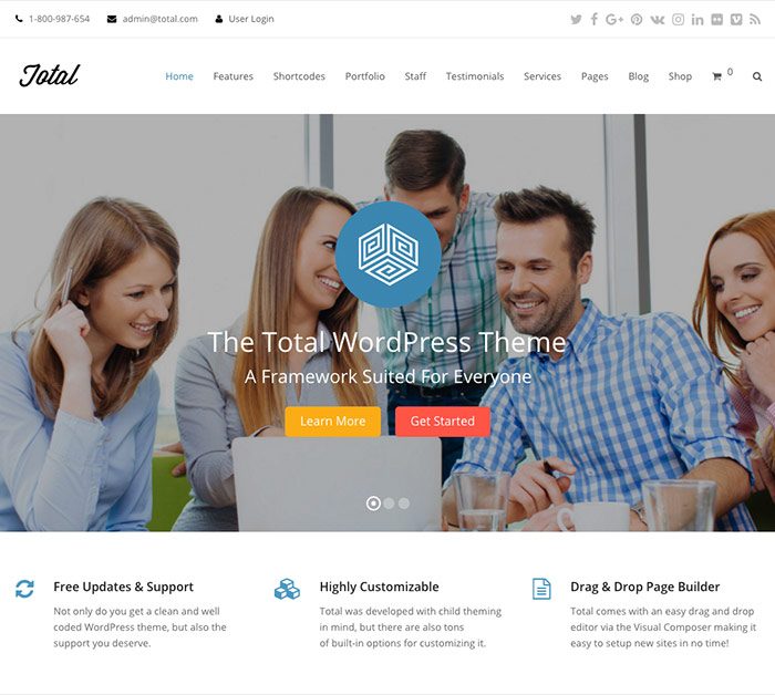
Today I want to talk about the Total Wordpress theme by WPExplorer. We'll look at…

One of my FAVORITE topics. :)
Vector graphics are created with math as opposed to pixels like a bitmapped image. Pixels are heavy. Vector is very light. AND it’s infinitely resizable. Your graphics will always be crisp at any size.
With that said, your logo should always be created in a vector-based program (Illustrator, Freehand, Korel) – NOT Photoshop. When a logo is created in Photoshop, designers can forget that this brand will need to cross over other mediums in addition to the lo-res webpage they’re creating it on. If they are mindful to use the vector shapes within Photoshop, that will help. But then you get into filters and such. There are things you can do in Photoshop that can’t be done in Illustrator (yet).
When a logo is created with these types of filters and treatments, the logo has trouble going to a larger size and has to be re-done to accomodate.
In addition to this issue, you run into a busy logo. Simple graphics and easily read type are crucial.
Consumers must have the same positive experience each time they come in contact with your logo, they must also have the same image of the logo reinforced each time they see it. In fact, in today’s sea of technological advertising, a person must see an image, such as a logo, at least seven times before it registers. If, during those seven times the image appears differently, the preceding viewings are canceled out; and the individual must see the image an additional seven times for it to register.
Stay true to your brand and it will stay true to you!


