Current Social Media Templates
This post will be the place to find current templates for social media skins. Rather than muck up my other post about social media templates, I thought it would be better to add them here.
This post will be the place to find current templates for social media skins. Rather than muck up my other post about social media templates, I thought it would be better to add them here.
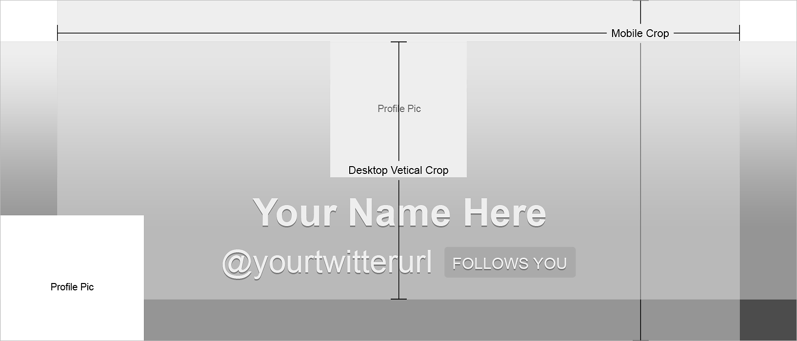
5/1/2014 Update: As Murphy's Law would have it, Facebook changed their layouts again yesterday. I have updated the template and you can download it here: 5/1/2014 Facebook Template I will continue to update the templates as Facebook and other social media outlets update their layouts. Just check this post when you see things have changed on your profile pages. Please note the new template above is not reflected in the examples below. I'm too angry at Facebook to update everything. I want to share some info on social media templates, or skins, as they're sometimes called. I have worked up a series of examples and templates for you to use from a site I manage called Baubles-n-Bling. Download the layered PSD templates if you want to follow along! It all starts with the main site. We recently migrated it over to Shopify. When we post the new sale on the homepage, we want to spin this look out across all social media outlets. This is the sale hero that appears on the site:
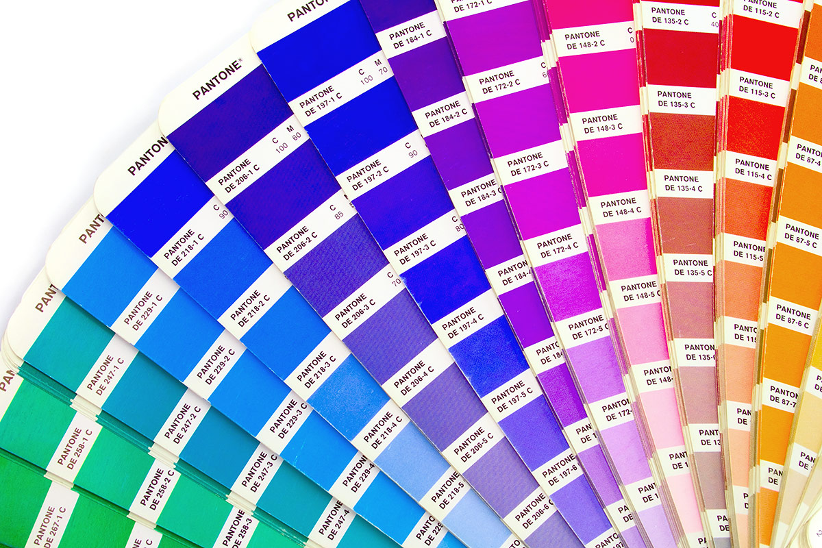
Have you ever had a logo created and then tried to have it printed, only to find out that it looks like crap? Well, dry those eyes. There is help. :) Any time you have a logo created, it should be created in vector-based format (we'll get into vector-based objects and their value tomorrow... stay tuned). The relevance here, when dealing with color is... Creating your logo in vector will allow it to go from print to web flawlessly. Photoshop doesn't maintain true Pantone values and can skew your color slightly. Even being just a few numbers off can create a bad color situation. Pantone colors are a set of colors that can go from spot (RGB) to 4C process (CMYK) without as much variation between the conversion from RGB to CMYK than if you just went into your color pallette and started mixing colors willy nilly. When you break down a color to 4C process, you loose saturation. You only have 4 colors that need to make up thousands or millions of colors, so there will be variation in your color when the conversion takes place. Pantone colors reduce the amount of variation. They have swatch books that you…
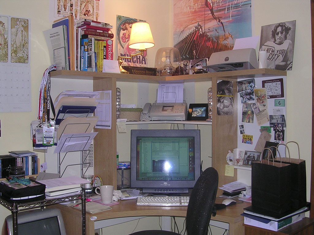
Have you seen Office Space? Man was NOT meant to spend 8 hours a day in a cubicle, indeed. It is important to like the environment you're in. Is your "office" a drab cubicle that holds no inspiration? Make it your own! Hang up some sweet artwork or put up some lights. Put some bling on your monitor - only if it's your computer though! Put some flava in your space. ;) Some establishments don't condone free thinking, individuality or creativity. They may not want you bringing in your tie-dyed tapestry from college to make a fort over your cubicle. Bastards. But you can find things that will get you energized about your work. Take a few minutes between projects and watch those things. Stare at them. Relish in the good things they represent. Then get back to work. I do this a few times a day, especially when I am concepting for a brand. New ideas are everywhere! Here are some pics of my Office Space to get the ideas flowing: