Client: Denny Karchner
Role: Marketing, Creative Direction, Design, Programming, SEO, Social Media, Print Production
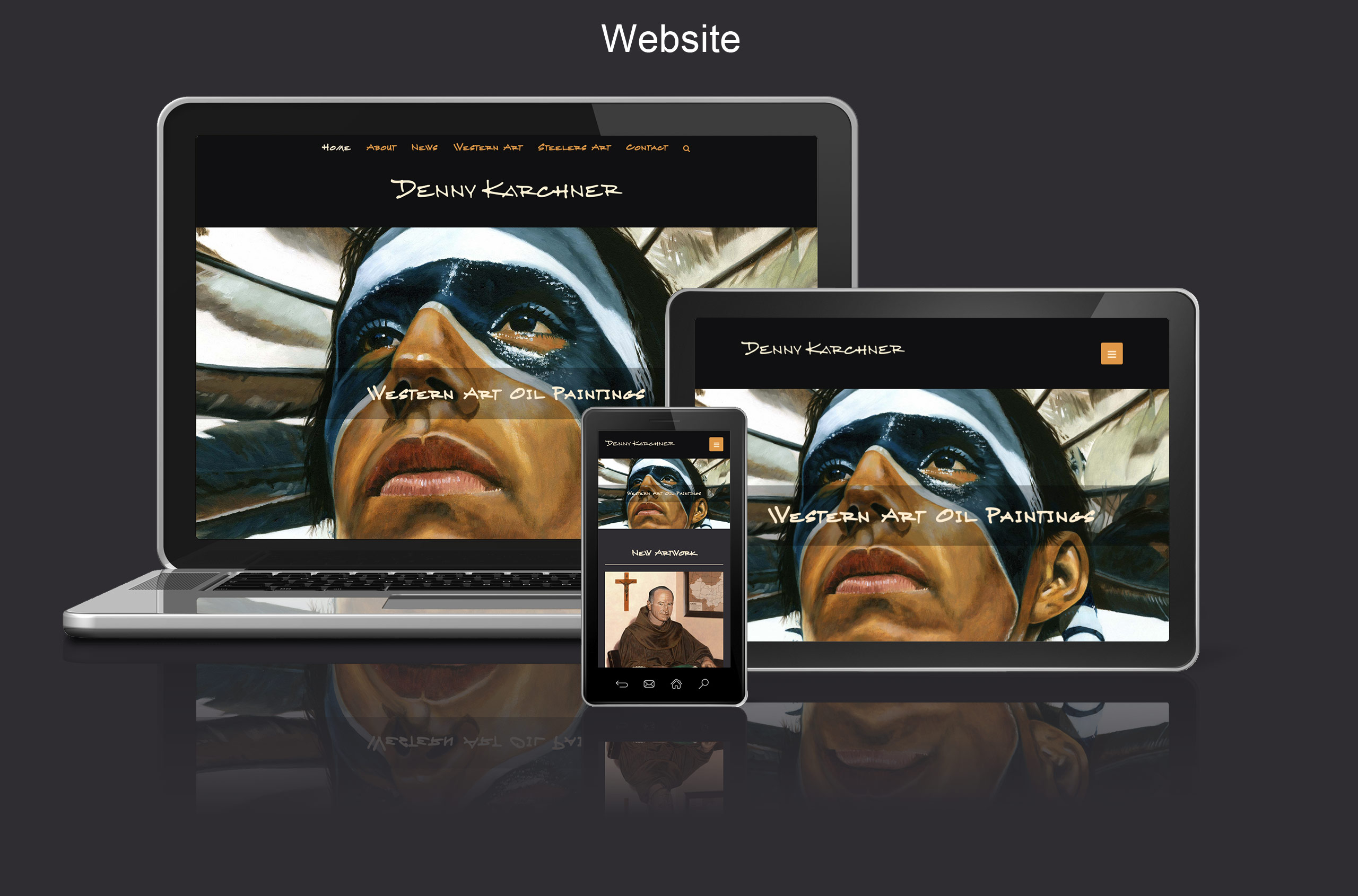
The website is a classic example of a static informational responsive website. I say static, meaning it simply holds information as opposed to processing payments. While it is only used to display information, it is a dynamic site created using WordPress.
Blogs being so easily adaptable, it is pretty much what we’re putting everyone in now for a static site. Sometimes a basic HTML or PHP site is sufficient, but usually not. Clients always seem to end up needing more functionality down the road. By using a CMS like WordPress, Drupal, etc. we are able to give them a lot of functionality they may not even know they needed in the beginning. This saves us from having to go back in later and charge them to add hand-coded modules and coding. AND… Since this is my Dad’s site, I figure I should try and save him a few bucks.
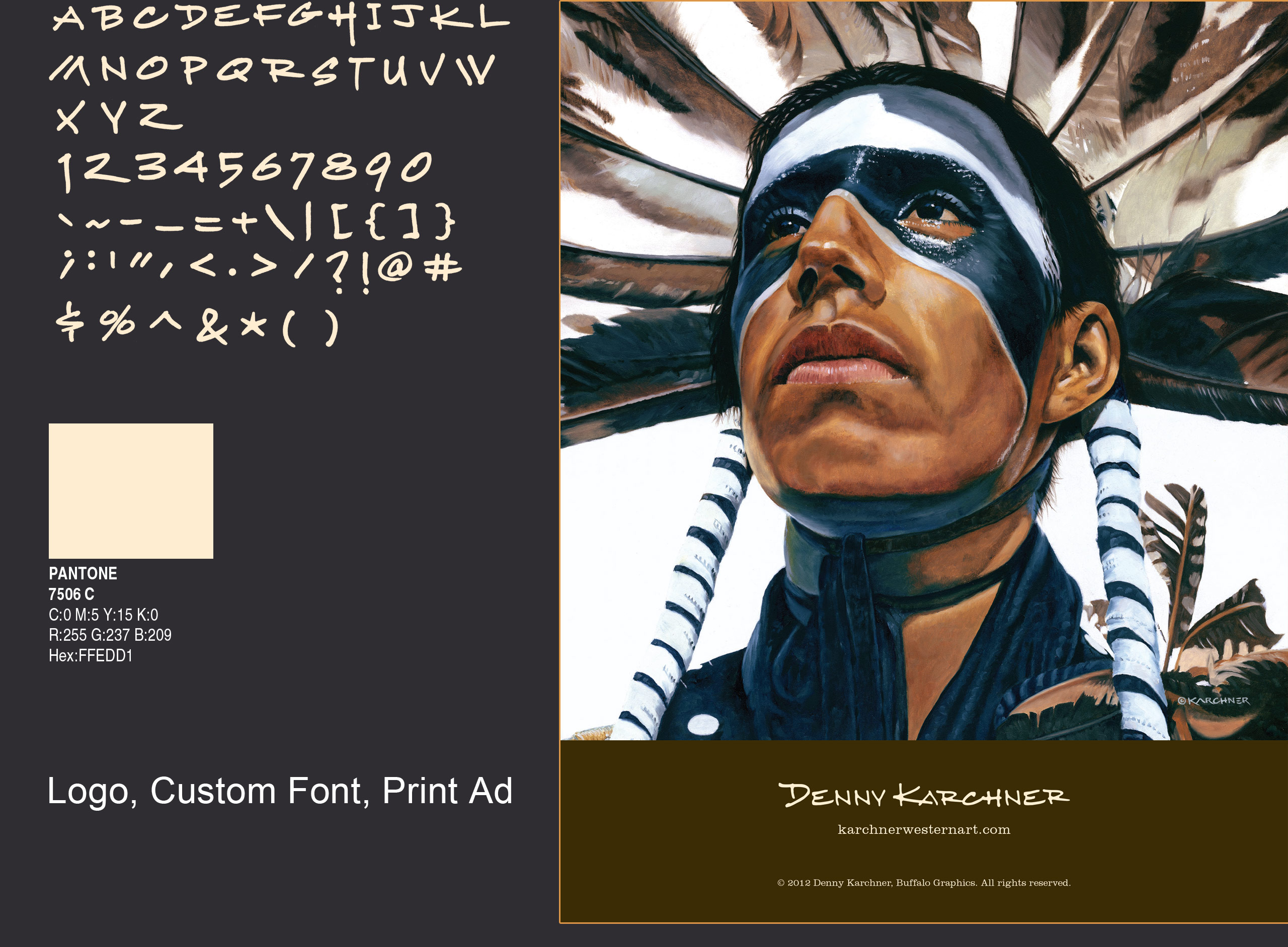
See the detail that he brings to his pencil illustrations. The textures of his oil paintings seem as though you can reach out and feel the leather, fur or grasses represented in them. This site is the stage with which we use to showcase all of his work. The dark background allows the eye to focus on the detail and color of his artwork without being distracted. We hired a fontographer to make Denny’s handwriting into a font, which is the type you see on the site for the logo and navigation. The index page has good organic search engine optimization to get us coming up on page 1 for our terms in Google and other search engines. If anyone wants to buy a print, they can purchase easily from our retail site, BuffaloTraderOnline.com.
The print ad showcases Denny Karchner’s Proud – Jay Eagle painting. The full page ad was ran on the inside cover of the November 2012 issue of Backwoodsman Magazine. His artwork was also featured on the cover.
View the site here: Denny Karchner

