Client: Andrea Lawrence Skin Care
Role: Marketing, Creative Direction, SEO, Design, Programming, Print Production, Social Media
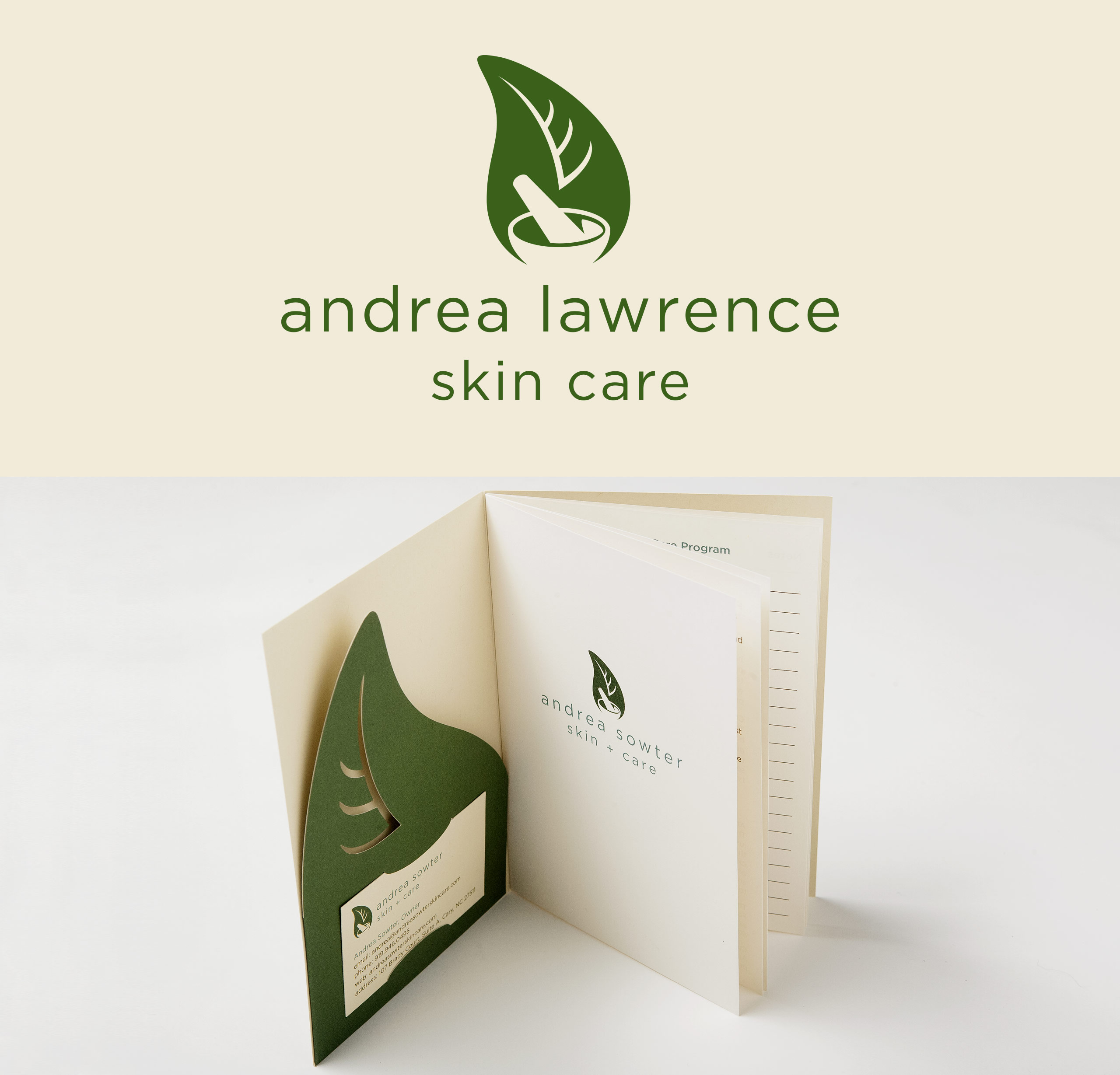
Andrea needed a brand that conveyed her holistic nature and processes in her skin care practice. We achieved this by creating a contemporary logo that clearly conveys these points to the consumer. As more and more consumers are looking for whole, organic, and local goods, it was easy to tell Andrea’s story about her business – nature is what she is all about.
Once the logo was established, we took that mark and created Andrea’s print materials. To keep it green, we (of course!) used 100% recycled French Construction Cement Green for the folder and business cards. French Construction Whitewash was used for the inside pages.
Andrea also needed a print piece that could serve multiple purposes. We wanted to negate paper waste and printing costs initiated by having multiple pieces created. We created a single folder with a custom die to accommodate the leaf-shaped pocket. This is used to hold sample packets of products and/or gift card inserts that were also printed. The folder also has slits to hold her business card. Inside the folder we saddle-stitched a booklet containing all of her services, pricing, and space for her to create a customized skin care regimen for her clients. The whole folder fits into a standard A7 envelope, ensuring delivery without additional postage. BOOM!
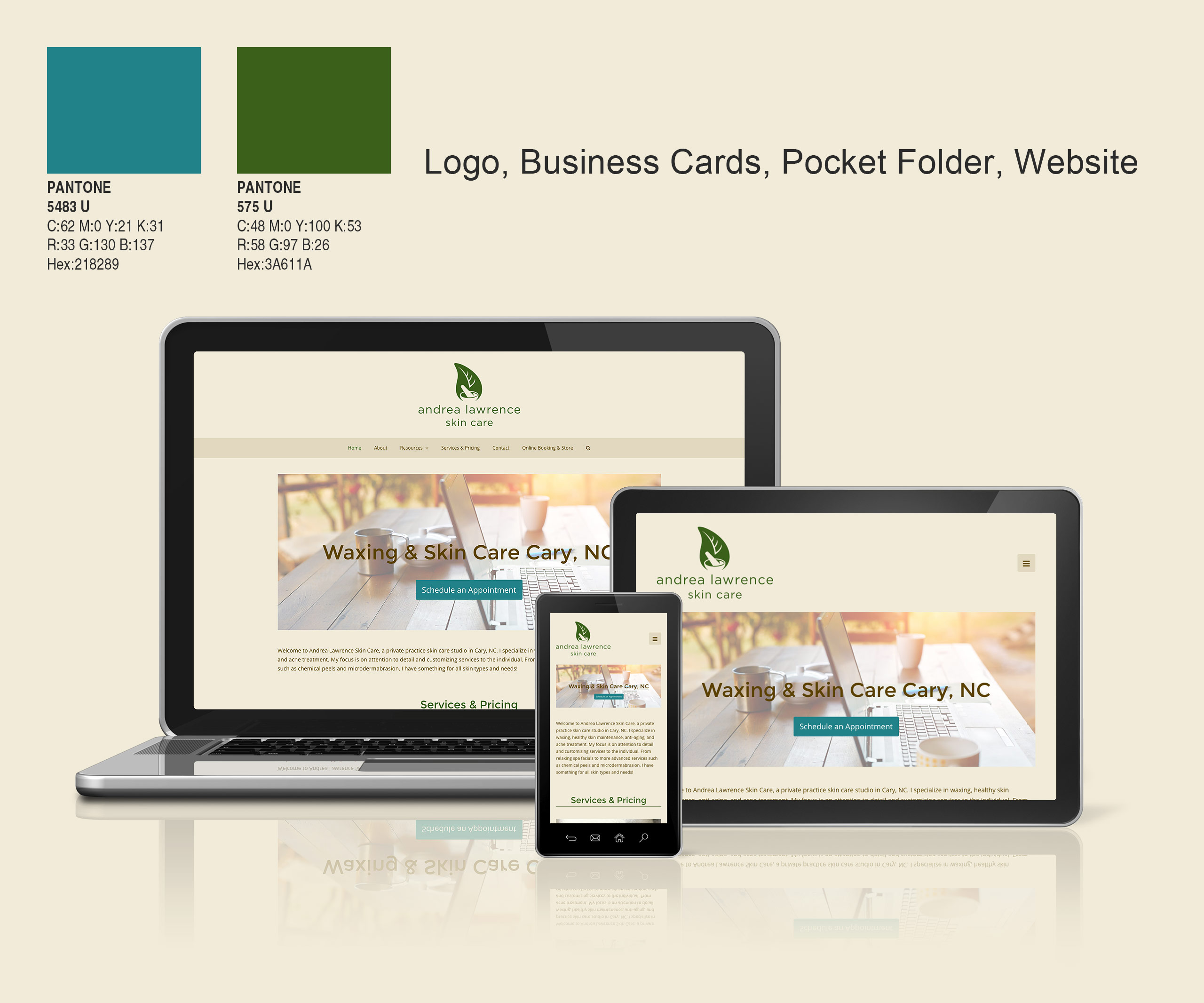
After the print materials are done and sent off to the printer, we tackle the website. All of the same info from the brochure is reiterated here, along with many tips and FAQ’s on skin care.
We recently relaunched the brand because Andrea got married and changed her last name. We revised the logo and all marketing materials except for the print brochure. A reprint is coming on those this year. We took this opportunity to re-do the website in a responsive theme, making it mobile friendly.

